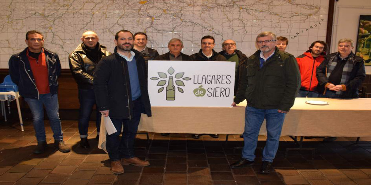
The new imagotype was presented in Llagar Quelo, Tiñana, on Thursday.
LA SIDRA.- Unity is strength. That is the view of the twelve cidermills covered by the mark “Llagares de Siero”.
For that reason, they have decided to have their own logotype, designed by Chiwake Comunicación, which combines two main factors in cider culture: the bottle and the apple tree, linking this way the ideas of nature and natural cider.
In shades of green and simulating the shape of an Asturian tree, whose trunk is the bottle, it will be used in road signs to show the location of the county cidermills.
The initiative joins the brochure presented weeks ago, which reflects the history of apples and cider, the cidermaking and information about the cidermills, including pictures, equipment, services, capacity, awards and how to contact them.
About 2,000 copies have been printed and will be available in the own cidermills, the Tourist Office of the Principality of Asturias, municipal facilities and commercial areas.
The cidermills included in the brochure are the following: Arbesú, Corzo, Quelo, Fanjul, Fran, Juanín, La Morena, Los Bayones, Muñiz, Torre, Viuda de Palacio, Casería San Juan del Obispo, Fonciello and Roza.
http://www.ayto-siero.es/recursos/doc/El_concejo-de_siero/Informacion_turistica/40847_46462012184222.pdf


